Hello. We will learn about pivot tables in Google Data Studio in this tutorial. How do pivot tables work? The most interactive kind of regular tables are pivot tables. We saw how pivot tables enable us to add calculated fields and gain so many built-in aggregate functions in Google Sheets, and we used them to expand the usefulness of the tool. Similar to this, we use pivot tables in Google Data Studio to create more simplified versions of our tables that make it easier for people to interact with them. Technically speaking, To have two continuous dimensions for a single piece of data, we prefer to use pivot tables over regular tables. In Google Data Studio, pivot tables come in three different varieties. We’ll look at every option and attempt to determine why utilizing pivot tables in Google Data Studio is preferable to using regular tables.
Why is it Important to use Pivot tables in Google Data Studio
To apply improved data visualization for our raw data, we employ Google Data Studio. Apart from the visualization, we have no other reason to use it. Additionally, pivot tables are made for improved visibility. When a user views a pivot table, they should be able to quickly decipher what the data is trying to communicate. Pivot tables are primarily meant to enhance message delivery and create more communicative data.
With Google Data Studio, pivot tables let us get deeper and more precisely into the data. For instance, if you want to display website traffic from different sources, you may go beyond the figures for each page in a regular table. Although a pivot table allows you to display every page and its traffic data from every source, it will automatically create a multi-column table to accurately display all these insights. All these parallels will be seen in a later version of this paper. For these reasons, among others, we must become familiar with pivot tables in Google Data Studio.
How to use Pivot Tables in Google Data Studio
We will next go step-by-step through learning pivot tables in Google Data Studio. First, we’ll learn how to create a basic pivot table. Next, we’ll create a regular table and compare the two to see how their visualizations differ. Finally, we’ll learn how pivot tables appear when shared with others in editing mode. Finally, we’ll learn how to use the other pivot table variations that are available, like those that include bars and heat maps. Now, let’s get going.
You may also like>>> How To Setup Social Media Reports In Google Data Studio
How to Create Pivot Tables in Google Data Studio
We will learn how to easily create a pivot table in Google Data Studio in this part. This tutorial begins with the Data Studio home screen. I have linked an example data source (Google Analytics sample data) specifically for this purpose. Any sample, any data source, or your own can be used.
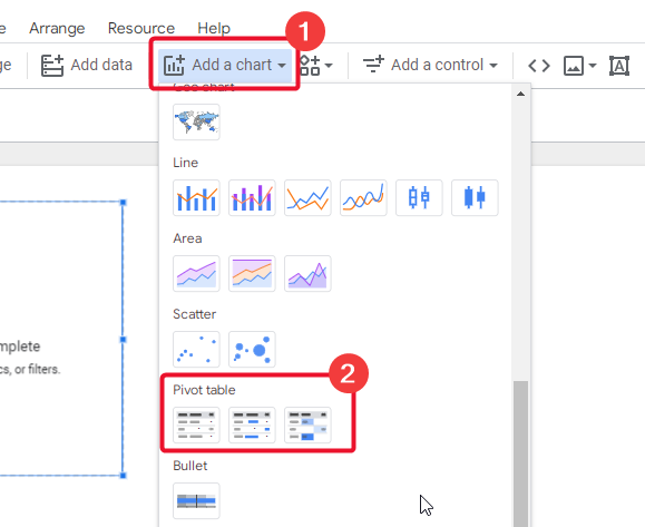
Step 1>
Navigate to Insert and select Pivot Table.

Or
Select a pivot table after clicking Add a Chart.
Step 2>
By dragging the table into your canvas, you can create a pivot table using the default dimensions and metric.


Step 3>
Here’s a dimension for rows.

Step 4>
Choose a different column diameter.

Step 5>
Choose a metric now.

Step 6>
View this table in view mode now.
In the report’s right corner, select the “View” button.


Thus, this is how to use Google Data Studio to easily generate pivot tables.
Now that we have a basic table created, let’s see how pivot tables are visualized differently. This will help you grasp them better.
Pivot tables in Google Data Studio – Tables vs. Pivot Tables
We will learn about two different forms of pivot tables in Google Data Studio in this section. Since Google Data Studio has three normal tables and three pivot tables, let’s look at the two types of pivot tables and normal tables in this section.
Step 1>
Make a table and include some data in it.
Select “Add a chart” and then select the table.

Step 2>
Make a pivot table and fill it with comparable data; if the table and pivot table cannot have the same dimensions and metrics, don’t panic. Pivot tables and regular tables differ in functionality; pivot tables are unable to display all dimensions and metrics.
Choose “Add a chart” and then select the pivot table.

Step 3>
To observe the difference in great detail, open the report in view mode.
Select the View button located in the upper right corner.


Step 4>
The table displaying static data for the dimension and metric we added is now visible.

Step 5>
On the other hand, the pivot table presents supplementary information that tells a tale, provides a comprehensive response, and ensures that the user understands it.

Step 6>
As you can see, there is a highlight over the portion of our pivot table that we are hovering over. This creates a gray, table-like area that better displays the real statistics. We didn’t utilize drill down, multiple metrics, or optional metrics while creating the columns in the pivot table; instead, the pivot feature built the columns automatically.

The narrative thus goes that a standard table merely displays the number of new visitors to the website on a single page. A viewer can observe, for instance, that 200 new people are visiting the main page, 100 are visiting the blog page, and so forth.
However, we can see that the table reflects the new users on the sites together with their sources in a pivot table that uses the same data and metric dimensions. One may clearly observe, for instance, that 400 visitors to the home page come from organic sources, 100 from sponsored sources, 50 from direct searches, 100 from Google, and so on.
Have you understood the difference between the two? We now have more control over our data when we use pivot tables, and anyone looking at this report can comprehend with ease that this number of users is going from these sources to these sites. Except for the optional metric feature, which is distinct from this, we are unable to obtain numerous metrics in a regular table.
Let’s now explore the pivot table variations available in Google Data Studio.
Pivot table variations in Google Data Studio
We’ll look at Google Data Studio pivot table variations in this section. Pivot tables come in three primary varieties: 1. plain pivot tables; 2. pivot tables with bars; and 3. pivot tables with heatmaps. Let’s now examine how these qualities can raise the caliber of our table’s delivery. Using the same data, we will examine both of these variations.
Step 1>
Navigate to “Add a Chart” and select the bar-shaped pivot table.

Step 2>
It’s right here. You observed how the data is represented. A pivot table that has bars indicates that the value will be represented by a bar rather than by numbers.

We will see these customization options in the coming tutorials, but for now, we can adjust these bars’ colors, expand, border color, thickness, and other attributes.
Let’s now analyze the following variation.
Step 1>
After selecting the “Add a Chart” option, select the Pivot table with heatmap.

Step 2>
This is where it gets interesting. Although the values are still there, the entire table has been transformed into a heatmap that uses colors to depict the values. Values are highest in the darker color box and lowest in the lighter one.

Thus, this is the operation of these two Pivot table variations. I hope the pivot table and these two varieties prove to be beneficial to you.
Now that the color scale and many other aspects of the Pivot table with heatmap can be customized, we will undoubtedly see more customization options in future articles in this Google Data Studio series. However, keep in mind that this is not a customization guide.
You may also like>>> Best Google Data Studio Functions For Calculated Fields [Best Guide]
Key Notes
- The dimension and metrics for tables differ, so you can run into issues where the issue isn’t really a problem at all. Additionally, pivot tables might cause dimensions like “User” to appear in a table but not appear when you try to locate them for a pivot table. That’s quite normal; unlike a regular table, a pivot table automatically generates numerous measures to visualize data more deeply. As a result, a pivot table can only display the dimensions for which there must be more than one conceivable metric.
- There are just two distinct methods to depict data values: a pivot table with bars and a pivot table with a heatmap. The heatmap displays values and creates a heatmap for the values, while the bars remove the numerical values and add meters, such as horizontal bars, to show in place of the values.
- For standard tables, these two variations are also available.
- Your pivot table data can be expanded or collapsed using the “Expand – Collapse” toggle option located in the Chart’s sidebar.
- The grand total of the row values can be shown at the bottom of your pivot table by using the “Show grand total” checkbox located inside the Rows section, and the grand total of the column values can be shown on the right by using the “Show grand total” checkbox located inside the Column section.
- Additionally, you can designate Sort Ascending or Descending using radio buttons.
- Except for optional metrics and drill-down functionality, pivot tables have two dimensions and one measure.
You may also like>>> Top 3 FREE Community Visualization Apps In Google Data Studio [Free Apps]
Conclusion
As we wrap up our discussion of pivot tables in Google Data Studio, we now know what they are and their purposes. We discussed the different types of pivot tables, such as those with bars and heatmaps, and how to make them. We also demonstrated how a user might obtain more detailed information and insightful analysis of the data. To further illustrate why pivot tables are necessary, I also provided a comparison between a regular table and a pivot table. I’m hoping you’ve read the post all the way through and are familiar with pivot tables in Google Data Studio. Thank you, and enjoy more Office Chaser Guides.