Hi everyone, and welcome back to another guide of our series on Google Slides. We will learn how to make a graph in Google Slides in this tutorial. The term “Graph” is the same as what you call characters in Docs, Sheets, and Slides, so don’t worry about it. To create a more customized version of the graph, we will explore the various ways in which a graph may be created in Google Slides by changing its pieces and applying built-in algorithms.
A chart and a graph are distinguished by their axes. A pie chart is not a graph because it lacks an axis; similarly, there are more charts available in the Sheets, Slides, and Docs, but not all of them are graphs. I hope you now understand the fundamental distinction between a chart and a graph. A graph must have axes; the x, y, and z axes are required, while the z-axis is optional.
To create our charts in Google Apps, we primarily use the pre-installed chart templates. However, pre-made templates can also be used; the choice is now yours as to whether you trust the source from which the template is being imported or the template supplier. To ensure that everyone may benefit from this tutorial, I will solely utilize the built-in graphs.
Why We Need to Make a Graph in Google Slides
Visual Clarity: Google Slides graphs give complex data a visually clear representation that makes it simpler for the audience to comprehend correlations, trends, and patterns.
Improved Presentation Aesthetics: Using graphs gives your presentation more visual appeal and makes it seem more polished and interesting. Slides with a lot of text are broken up and the audience is kept engaged.
Better Data Comprehension: Graphs make difficult numerical information easier to understand, so that important insights may be retained and understood rapidly by the audience. This is especially helpful for comparing and providing trends, or statistics.
Easy-to-Use Tools: Google Slides provides graph creation tools that are easy to use. Even individuals without considerable design or data visualization abilities can easily build charts and graphs because of the platform’s user-friendly interface.
Flexibility in Data Representation: Graphs in Google Slides offer a flexible way to display information, letting you select the best kind of chart for the data you’re presenting, be it business KPIs, survey findings, or any other quantitative data.
You may also like>>> How To Make A Pecha Kucha On Google Slides
How to Make a Graph in Google Slides
This entire topic is divided into three sections. First, we will learn how to create a graph in Google Slides. Next, we will see how to edit the data so that it is more unique to us or our business. Finally, we will learn how to customize the graph by using certain colors, fonts, themes, and other elements.
How to Make a Graph in Google Slides – Creating a Graph
This section will teach you how to create a graph in Google Slides and how to include a graph in a slide. It’s a very simple component that just requires a few steps to complete. Now let’s execute it using our Slides presentation.
Step 1>
Select any chart other than Pie by going to Insert > Chart.

Step 2>
The chart will be placed on your active slide automatically as you click on it.

Step 3>
This is your graph, as you can see. An x- and y-axis must be present on a graph.
As you can see, to plot our original data into this chart, we need to first change the dummy data that was used to create it.

Step 4>
The graph’s source can be accessed by clicking the “Open source” option located in the top-right corner of the graph.

The location of the data that is plotted on the graph is the source.
When you click the Open-source button, a new tab will open and your chart and the data it contains will automatically generate into a Google Sheets file.
The sheets files are linked to this Slides file and are only viewable to you.
How to Make a Graph in Google Slides – Configure the Graph Data
This part will cover creating a graph in Google Slides and configuring the graph’s data. As I previously mentioned, if you create a graph or chart on your original Slides, you also get a corresponding Sheets file or Doc file. Let’s work on the Sheets file alone in this step to change the data, which will show up in our Google Slides chart.
Step 1>
Open the related Sheets File.

Step 2>
Since the file is editable, you can start by clearing off all of the text data from the sheets, which will leave the graph blank.

Step 3>
Start entering your data now, or copy it from another source, and paste it into this place.

Step 4>
You can observe the graph’s real-time changes as you make changes.

Step 5>
When you’re done editing the data, return to the Slides file. There will be an update button in the top-right corner of the graph; click it to update the changes you’ve made.

Step 6>
The graph has been updated. This is how to easily create a graph in Google Slides and then configure the data on the graph.

So far, we have learned how to put a graph in a slide and how to quickly work with the data in it using a related Sheets file. Let’s go on to some more personalization options now.
How to Make a Graph in Google Slides – Personalize a Graph
We will learn how to create a graph in Google Slides and how to edit it in Google Sheets in this section. Please take note that Google Slides and Docs do not offer any options for customizing charts or graphs. Indeed, you can style the graph as a picture in Slides and Docs, but this will only allow you to see the graph as a whole, not its components. Thus, we will personalize our graph using Google Sheets.
Step 1>
In your Graph, click the Open-source button to open your Sheets file.


Step 2>
In the upper right corner of the graph, click the three dots, and then choose Edit the Chart.

Step 3>
You have two tabs here: setup and customized, Click on the customized tab.

Step 4>
Here are all of the Google Sheets customization options for your chart. You have complete control over the graph, and each time you click the update button, the graph will be updated in the Slides.

Step 5>
The first choice “Chart Style” allows you to change the general style of the chart.

Step 6>
Both the chart’s primary title and its axis titles can be changed in 2nd part “Chart & axis titles”.

Step 7>
In the third section ”Series”, you can change the series. Series refers to the data points’ rising high and falling low bars.

Step 8>
You can work with a legend in the 4th part “Legend“. In a word, the bars conclude by instructing you on how to identify the bars using their colors, so legend signifies identity.

Step 9>
In the 5th part “Horizontal axis“. you can adjust the horizontal axis even more.

Step 10>
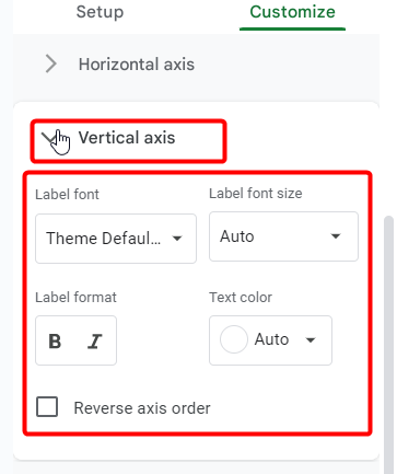
in this 6th part “Vertical axis” comparable choices are shown above, but just for the vertical side axis.
Step 11>
In the 7th part “Gridlines and ticks” you manage the ticks and gridlines on your chart. The background lines known as gridlines are what make it easier to display the general page layout, like the Sheets file layout.

Key Notes
- Before making the graph, make sure your data is correct and current to prevent inaccurate information.
- Keep the font styles, colors, and graph layout constant throughout your presentation.
- Give your graph’s clarity priority. To aid in the understanding of the data by your audience, use legends, axis labels, and descriptive titles.
- Practice the timing if you plan to use animations to make sure your presentation flows smoothly and at the right speed.
- You should think about backing up your data, particularly if it’s connected to Google Sheets. In the event of unintentional alterations, you will have a reference point thanks to this.
You may also like>>> How To Make A Brochure On Google Slides [Updated Guide]
Frequently Asked Questions
Is it possible to directly edit the data in the graph in Google Slides?
No, a Google Sheets spreadsheet is linked to the data in the graph. You should make modifications to the linked spreadsheet in order to alter the graph’s data; Google Slides will then automatically update the graph.
Are the Procedures for Creating a Graph and Pie Chart in Google Slides the Same?
Yes, building a graph in Google Slides and producing pie charts in Google Slides are much the same process. Both data selection and chart type selection are necessary. Pie charts, on the other hand, only show proportionate numbers, whereas graphs can show many kinds of data correlations.
How do I label the data on my graph using trendlines?
Click on your graph, select “Chart editor” (often on the right side), and then look through the “Customize” menu to add trendlines or data labels. This is where you can adjust the data labels and add trendlines.
Is the graph in Google Slides downloadable or exportable?
Yes, you can export your presentation in its entirety, complete with the graphs, as a PDF or picture file. To select your preferred format, click “File” and then “Download“.
You may also like>>> How To Edit Master Slide In Google Slides [Complete Guide]
Conclusion
Today, we learned how to make a graph in Google Slides. To put it briefly, graphs in Google Slides provide dynamic visuals with little work. It’s a go-to tool because of its seamless connection with Sheets, customization choices, and real-time collaboration. Easily improve your presentations with Google Slides—the place where impact and simplicity meet! For more keep learning with Office Chaser.