Welcome to Office Chaser Today, we are going to learn how to make a stacked bar chart in Google Sheets. Data is represented by bars in a stacked bar chart, which further breaks the data into smaller bars for easier data visualization. As everyone is aware, adding a chart to Google Sheets is quite simple and just requires one click. Next, by changing its type, you can turn your chart into a stacked bar chart. The following tutorial will walk you through creating a stacked bar chart in Google Sheets if you’re still unsure about how to do it.
Why do we need to use a Stacked Bar Chart in Google Sheets?
Part-to-Whole Relationships Visualized: Stacked bar charts are an efficient way to show how each component contributes to the whole. When you wish to display the distribution or composition of various categories inside a dataset, this is quite helpful.
Comparing Total Values Across Categories: Stacked bar charts preserve individual component visibility while facilitating quick comparisons of total values across categories. Rapid and easy comprehension of the material is made possible by this visual representation.
Monitoring Changes Over Time or Categories: A stacked bar chart makes it simple to monitor changes over several time periods or categories, which is useful if your data comprises a time series or multiple categories. This can be quite important for figuring out patterns and trends.
Emphasizing Relative Size: The stacked arrangement aids in bringing attention to how big each component is in comparison to the total. It offers a rapid comprehension of the ratios and differences in the dataset.
You may also like>>> How To Calculate Hours Worked In Google Sheets [2 Ways]
How to Make a Stacked Bar Chart in Google Sheets
You must first insert a basic chart in Google Sheets before choosing stacked bar chart from the chart types in the chart editor to build a stacked bar chart in Google Sheets. I’ll demonstrate it in practice in the next step-by-step tutorial.
Step 1>
You will first need a table, or the kind of chart data that is displayed in the following image, where we have two different values for Males and Females for various years, in order to create a stacked bar chart in Google Sheets.

Step 2>
After creating a table with sample data, select all the values by dragging and dropping the mouse pointer over them, as I have done in the example below.

Step 3>
Once the data has been chosen, construct a stacked bar chart by selecting the “Insert” tab from Google Sheets’ menu bar, as indicated in the screenshot below.

Step 4>
As seen in the following image, when you click the “Insert” tab from the menu bar, a drop-down menu will appear. Clicking on the “Chart” option will allow you to insert a chart into Google Sheets with only one click.

Step 5>
The result is displayed to you in the screenshot below, where the chart has been put; however, we need a stacked bar chart, and this one is line chart. Let us explore the process of converting this chart to a stacked bar chart.

Step 6>
As indicated below, when you click on this chart, a three-dot button will appear in the window’s upper right corner. To access its properties, click on it.

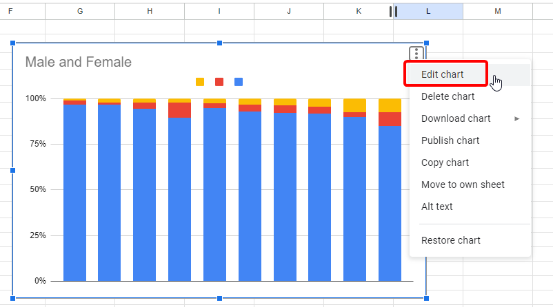
Step 7>
You can change your chart in Google Sheets by selecting the “Edit chart” option from the small drop-down menu that appears when you click on this three-dot option.

Step 8>
A pane menu including a chart editor will open on the right side of the window when you click the “Edit chart” button. The first choice you’ll find on this panel or pane menu is “Chart type“, which is underlined below. You can change the type of your chart by using this option.

Step 9>
Since a stacked bar chart is required, you will find a wide variety of chart types when you open the “Chart type” option. Choose a stacked bar chart from the list below that best suits your needs.

Step 10>
As soon as you choose the necessary chart from the list of chart types, your linear chart will quickly transform into a stacked bar chart, as seen in the result in the image below.

You may also like>>> How To Convert Excel To Google Sheets And Google Sheets To Excel
Frequently Asked Questions
Is it Possible to Make a Bubble Chart in Google Sheets the Same Way I Would a Stacked Bar Chart?
Yes, you can make a bubble chart in Google Sheets using the same procedure as a stacked bar chart. Choosing your data, launching the Insert menu, selecting Chart, and then picking the Bubble chart choice are the steps in the procedure. You are able to change your chart to suit your own tastes. So feel free to simply make a bubble chart in sheets.
Is It Possible to Modify the Color of the Google Sheets Stacked Bar Chart?
You can customize the chart color in Google Sheets to change the color of a stacked bar chart. Just pick the desired bar chart, select the Chart Style section, then click the Customize tab. You can then change the color settings to get a customized and eye-catching chart.
Are the Procedures for Making a Stacked Bar Chart in Google Sheets the Same as Those for Making a Regular Chart?
While making visual charts in spreadsheets might be quite simple, how do you create a stacked bar chart when the processes are the same as for a conventional chart? Yes, is the response! With just a few easy steps, users of Google Sheets may quickly and simply customize and build a variety of visual representations of data, whether it’s a standard chart or a stacked bar chart.
How do I label a stacked bar chart?
In a chart, source data is shown using data labels. Labels make it easier for readers to read and comprehend a chart. The instructions below outline how to label your chart in Google Sheets if it lacks labels, even though labels are occasionally produced automatically from the underlying data.
Step 1>
After inserting a chart in Google Sheets, select the three dots icon to bring up the chart’s edit mode. From the drop-down menu, select “Edit chart” to add a label.
Step 2>
Click the “Customize” button in the chart editor after it has opened. You will see a few tabs. Click on “Chart & axis titles” from the list of options that appears when you select the “Customize” tab.

Step 3>
The label chart drop-listed option is the first of numerous options that appear when you click on “Chart & axis titles“. From this drop-down box, you can add or modify all of the labels on the charts.

Step 4>
I’ll give you an example by labeling the vertical axis. I’ve returned “Population” for the vertical axis in my chart. After you select a drop-listed option, a text box will appear right next to it where you can quickly write your label for your chart and chart axes.

Step 5>
Simply dismiss the panel after making changes to your chart to view the result. In the example below, we have labeled our vertical axis “Population“.

How to format a data point in a stacked bar chart in Google Sheets?
With Google Sheets, you can arrange any data in the chart by highlighting a particular point using the data point format function. You can format a data point in your Google Sheets chat by following these steps.
Step 1>
Once the chart editor has reopened, select the “Customize” tab and then, as indicated in the accompanying image, select the “Series” option from the list.

Step 2>
A built-in “Format data point” option can be found in the panel as you scroll down after selecting the “Series” option in your chart editor, as indicated below. Click the “Add” button to add a format data point to your chart.

Step 3>
A little pop-up window will show when you click the “Add” button, and you will need to click on the drop-listed option to select the data point where you wish to format it.

Step 4>
Every point that has been added to your chart will be seen when you select the “Drop listed” option. All you have to do is click the “OK” button after selecting the data point.

Step 5>
Google Sheets will prompt you to choose the color you wish to use to format the chosen data point as soon as you click the “OK” button. From the following color gallery, choose the color you want.

Step 6>
You’ve almost finished; the result is displayed in the image below, where your chosen data point has been formatted in the color of your choice.

How can I download a stacked bar chart?
The most effective technique to show data and group it into blocks is using charts. It offers visually appealing and intuitive data analysis studies. Let’s say you are making a presentation and would like to include a chart you made using Google Sheets. Then, you can simply download your chart separately and add it to your presentation by following the instructions below.
Step 1>
When you select the three dots icon from your chart, a “Download” option will appear in the drop-down menu, as shown in the screenshot below.

Step 2>
You can download your stacked bar chart in Google Sheets in a variety of file formats by clicking on this download option, which will reveal another expand menu. Your chart will download after you choose the format.

Conclusion
Using Google Sheets to create a stacked bar chart is a great way to visualize complex data with several number columns. With the knowledge and abilities you’ve gained from this session, you can improve the clarity and impact of your data presentations. Accept the feature of stacked bar charts to create visually captivating stories out of complex statistics with ease. Up your data visualization game with this easy-to-use yet powerful Google Sheets application. For more helpful tutorials and guides keep learning with Office Chaser. Thanks.