This tutorial will teach us how to use color scale in Google Sheets. The purpose of the color scale is to present your data with a set of colors. For example, if your data consists of numbers from 1 to 5, you can add a color scale to divide it into three groups. Three belong to the mid group, 1-2 to the lowest group, and 4-5 to the maximum group. As a result, the colors will be the lightest for maximum values, the darkest for minimum values, and the average color for mid values.
However, this is merely an idea and not a constant. Of course, in addition to changing the colors, you can also adjust their intensity using percentiles, percentages, or integers. The way a color scale functions by default, when applied directly to data, is what I have just explained. However, we have a wealth of customization options to change the color spectrum, alter the color scale, and alter the colors based on numerical, percentile, or percentage data. Its max, min, and mid values are likewise modifiable.
What are the benefits of using Color Scale in Google Sheets?
Data Visualization: Data patterns and trends can be quickly and easily visualized with color scales. You can quickly determine whether values are higher or lower within a range by using colors to correspond with distinct data values.
Highlighting Extremes: To draw attention to the most extreme values in a dataset, color scales are frequently employed. To highlight greater values in green and lower values in red, for instance, you could utilize a red-to-green color scale, which would help you identify outliers more easily.
Comparing Values: Compared to simply looking at numbers, color scales make it easier to compare values between cells. This helps you quickly determine the distribution of values, which is especially helpful when working with huge datasets.
Heat Maps: Color scales are frequently used to make heat maps, in which the magnitude of each value is represented by the color of a cell. This is very helpful when displaying data in tables or matrices.
You may also like>>> How To Use OR Function In Google Sheets [Step-By-Step Guide]
How to use Color Scale in Google Sheets
This tutorial will walk you through the process step-by-step. First, we’ll learn how to use color scales in Google Sheets. Next, we’ll move on to customizing the color scales and creating our own. Finally, we’ll apply some real-world examples to gain a thorough understanding of color scales and all of their features.
The appearance of a color scale on sorted data
Only numeric data can be formatted using a color scale based on conditional formatting; characters and strings cannot be formatted with this type of data. They are merely numbers, and they can also be percentiles, percentages, or floating point values.
Assume for the moment that you have a dataset that includes kids from grades 1 through 10. You can apply a conditional formatting color scale based on numbers here for the standard column.
Look at this carefully.
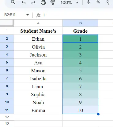
It appears to be a really nice pattern.
The Appearance of a Color Scale on Unsorted Data
When data is sorted, the color scale appears nice; but, when a list is not sorted, it does not look well.
View the identical, unsorted data set
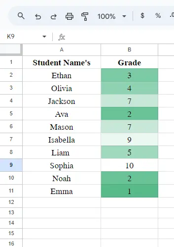
Don’t worry, there are a ton of other things we can do with color scales; it’s not only about them. Let’s examine a realistic example of adding a color scale to a dataset.
How to use Color Scale in Google Sheets – Include a Color Scale
Let’s add a color scale and some sample data in this part.
To do this, simply follow the procedures listed below.
Step 1>
Select the data (not the header).
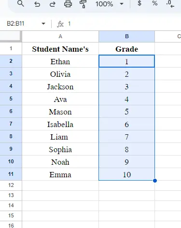
Step 2>
Select Conditional Formatting under Format.
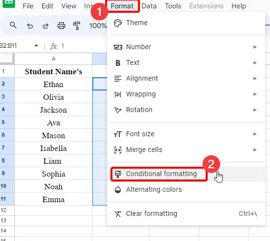
Step 3>
Select the tab for the color scale.
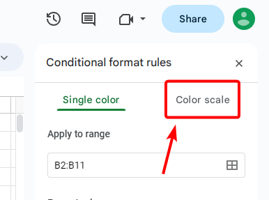
Step 4>
Click the scale to choose any pre-defined color scale in the section below on Format guidelines.
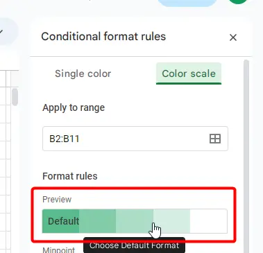
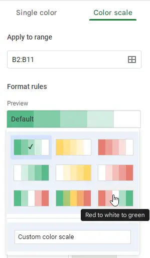
Step 5>
To create your own color scale, select Custom Color Scale.
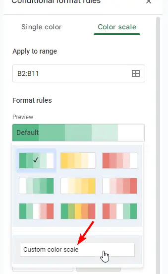
Step 6>
You must define two colors for the minimum and maximum values in order to define your color scale.
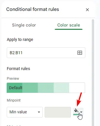
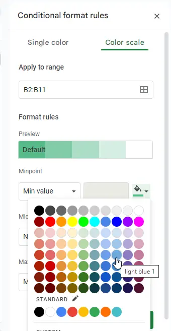
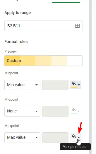
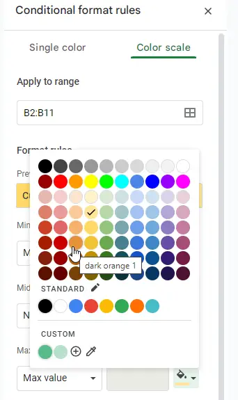
Step 7>
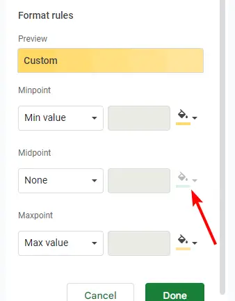
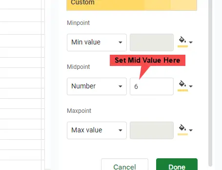
Mid value is locked by default, but you can set and unlock it by selecting a different unit from the selection (use appropriate to your data).
Step 8>
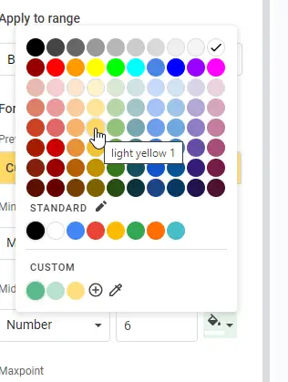
Set a color for the middle now.
Step 9>
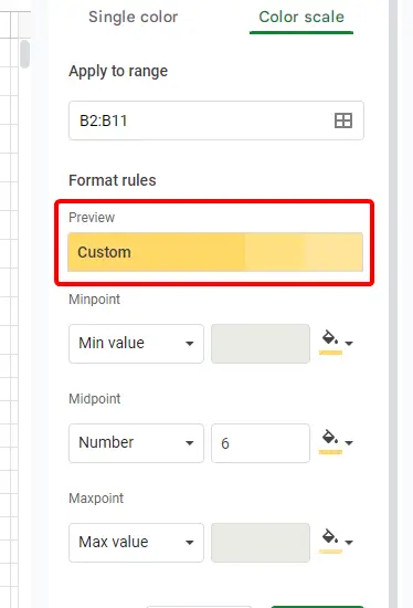
In the preview part, you can see all five of your colors (three of which you choose, and the other two chosen by sheets within the predetermined color range).
Step 10>
To save the changes and apply them to your data, click Done.
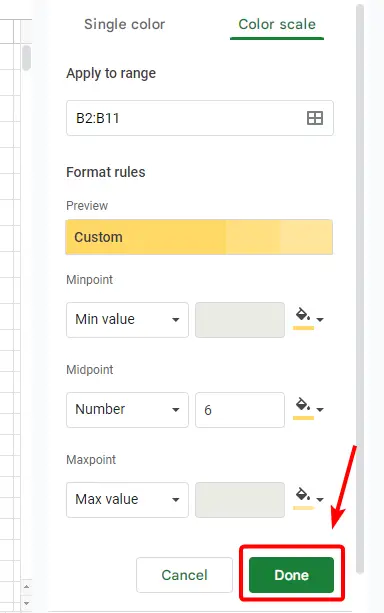
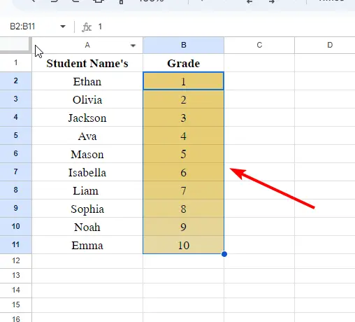
This is the Google Sheets method for using a color scale.
How to use Color Scale in Google Sheets – Color Scheme with a Percentage Basis
This section explains how to apply a color scale based on a percentage of the values in Google Sheets. Using a straightforward color scheme, we may create student percentages for a group of students.
I have a basic data set with the names of a few students and their percentage of marks for this example.
Step 1>
Demo data
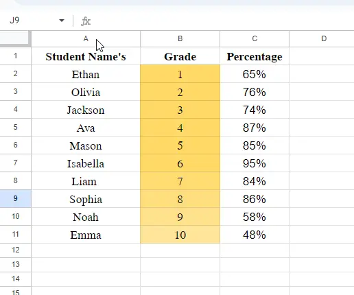
Step 2>
Choose the data column, keeping the heading out.
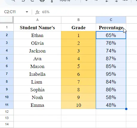
Step 3>
Select Conditional Formatting under Format.
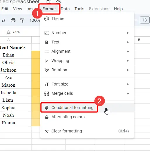
Step 4>
Choose the unit from the min, mid, and max dropdowns to be a %.
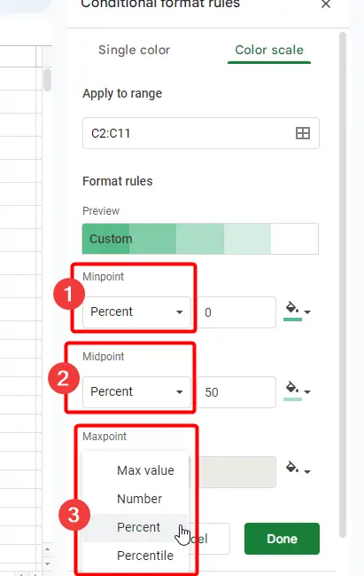
Step 5>
Choose hues for the minimum, middle, and maximum color pickers.
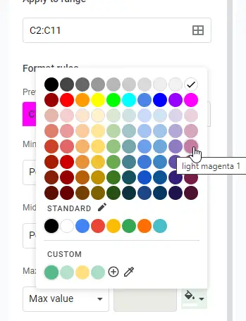
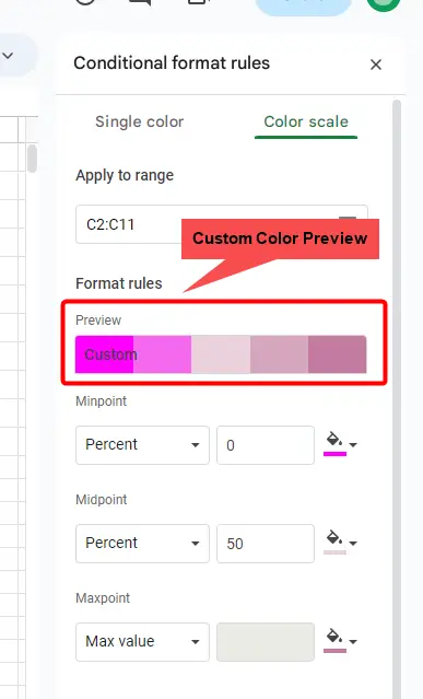
Step 6>
Once you click “done“, your data will be shown as color scales with percentages.
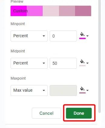
You can use color scales for percentage values in this way.
How to Make a Heatmap in Google Sheets By Using Color Scale
This section will teach you how to use a color scale in Google Sheets to generate a heat map. A heat map is a color-based visual representation of data, with the average color serving as the center or midpoint of the data and the lighter color designating one data point and the other data point depending on the intensity of the color. We can presume that it is on a scale of 1 to 10, with 1 being the darkest, 5–6 being typical, and 10 being the least intense. This makes it simple for us to see where our values are lower and where we still have work to do in order to raise or lower the value.
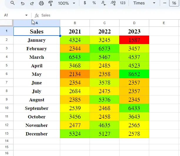
In this instance, I will use three data points to characterize the color of the sales from the previous three years. Any values in between will be taken as the closest color or as the low or high intensity/hue of that color.
Step 1>
Demo Data
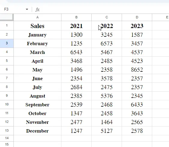
Step 2>
When you select data columns, choose Format > Conditional formatting.
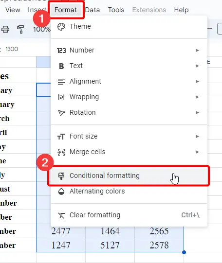
Step 3>
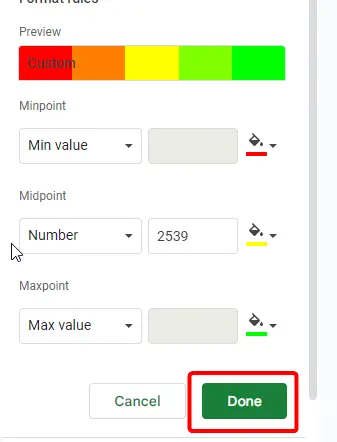
Choose the color scale tab and specify the hues/colors for each of the three positions.
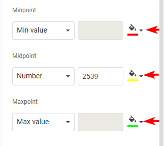
Step 4>
Press the “done” button. You’ve seen how simple it is for us to view the values and how quickly we can analyze the data to forecast the values.
You may also like>>> How To Print Addresses On Envelopes From Google Sheets [Quick Guide]
Frequently Asked Question
Is it possible to apply Color Scale and conditional formatting rules at the same time?
Yes, you can use Color Scale in conjunction with other conditional formatting rules in Google Sheets. This implies that you can provide your data with more complex and advanced formatting conditions. You can improve the overall visual representation of your information by gaining deeper insights into the relationships and patterns within your dataset by combining Color Scale with other formatting guidelines.
If my data changes, will the Color Scale update automatically?
Yes, the dynamic aspect of Color Scale is one of its benefits. Whenever there are modifications to the values within the chosen range, the formatting will be automatically updated. With no need for manual adjustments, this dynamic updating makes sure that your visual representation always reflects the most recent data, giving you real-time insights.
Can I use more than one color scale condition at a time?
Although there are many different color scales that Google Sheets allows, it’s important to think about how clear your representation will be. Although there isn’t a hard limit, a visualization that has too many color scale conditions may be difficult to understand and confusing. Selecting a small number of significant color ranges that best convey the trends in your data is frequently advised.
Conclusion
completing the tutorial on how to use color scale in Google Sheets. We now know what color scales are, where to find them in Google Sheets, and how they operate. Now that we’ve talked about color scale constraints, we understand that color scales can only be used with integer data types, such as numbers, floats, percentages, and percentiles. We observed the process of applying a color scale to a numerical data column. We also talked about the three points that control our data: the minimum, midpoint, and maximum points. We discovered how to modify the color of each data point and reverse any pre-established color scale to suit our preferred hues and intensities. That concludes the section on using Google’s color scale.
I sincerely hope that this article was useful to you. Until then, have a good day. I’ll see you soon with another useful guide. I value your reading and keep learning with Office Chaser.

